Friday 21 May 2021

My Outcome 


I could look at it, that after a years worth of work my final hand in will be one finished print, instead I'm looking at it as, 1 finished print another to carry on with straight after university keeping me active and busy post-education and a whopper of an A2 to print once I've sold something and on top of all this enough research and printing know-how to carry me at least a year or two into the future, with two prints completed and ready to send in to two international print competitions. Feel pretty good looking at it like that..

DAYBREAK


Here is the scan of the completed article, I won't give my working here its all on my instagram and throughout this blog all I will say is 19 colour watercolour woodblock.

SUNSET


as this is only a prep print its no where near the finished article, for starters the black was printed in sumi ink as I could do it at home instead of going in to uni for one press. This does mean that the key block doesn't have the gloss bold sheen that it will do when the edition is made like the print above. Also, at the time of printing an entire colour block was missing but it prints fine and isn't to much hassle, 12 colour watercolour and woodblock print A4.

MIDNIGHT


to it's nearest completed version the A2 of the series Midnight. Digital colour mock up. Something I hadn't mentioned up until now as I didn't deem it all that important was the financial side of these prints so, this print is yet to set me back around 200 more pounds and having near bankrupted myself on the first two, whether I had intended to have this finished for hand in or not wouldn't much matter now. I will begin the engraving on these blocks next week but may not have enough blocks they're to complete all the engravings, I can only hope at this point. Though, regardless of whether or not these blocks are completed next week or later, this print will certainly be made!


 The Prep prints


Always before sitting down and doing an edition I print a test run first, just in order to check all the blocks have all the necessary wood cleared away, no ink in unwanted areas and basically just to check that it is within my capabilities to print it.


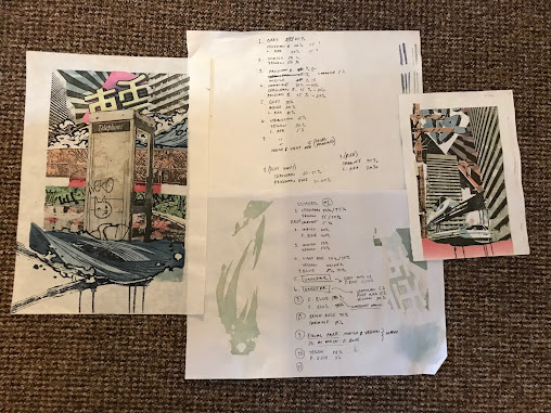
These are the two prints I pulled from the A4 and A3 blocks as a practice run, I wet 8 sheets for the A3 and after half the layers were down on all 8 I continued with only 4 and played with the print order and pigment mixtures, those I was happiest with got written down on a scrap sheet (seen in the middle) which had notes on all paint mixtures and print orders.

The same for the A4 but I was much more confident it would be an easier run through and so only wet 2 sheets for the testing as I was confident I would be able to run one of them at least through all the blocks.


Thursday 20 May 2021

 A4 Print


I am beginning the A4 print tomorrow, this is thursday, I won't have the print ready for the hand in unfortunately it will likely not be finished until Saturday, I have already wet the sheets ready for printing. I will upload the A3 print in its finished version later today and that will be about it for the blog I think, the A2 blocks will be prepped over next week and printed once I return home to glasgow after the 28th.


 Printing

with the A3 and A4 ready to print at this stage, I thought it best to go ahead with completing those instead of spending the last of my time prepping the blocks for the A2, only to end up without a physical print to show for it.

I went in to Uni to engrave the Keyblock on the lasers for both prints and got home and started work on the colour blocks. Around a week later I had the colour blocks complete for both prints and was ready to begin.

In my last effort to explain my printing process I did a poor job but only because as I found out to my own displeasure learning mokuhanga printing out of textbooks is not easy.

So I filmed some of the process to clear things up a bit (hopefully).


Adding water drop by drop to the board, this is crucially important as for every single layer if the moisture value is off by a single drop then the shade of the watercolour pigment will obviously be different to the last one


Same here, adding ink directly to the brush, this layer was a wash therefore the amount of ink was smaller than a normal block layer but thought I'd show this as the tiny touch of one brush to the other is the only transference of pigment before it is rubbed into the block, this is all that is needed to run a print from, once again a tiny bit too much pigment and the colour will be different, too little and the print won't pull. 


Rubbing the pigment into the woodblock, concentration is required, you know the block is ready when there is a very slight sheen/gloss to the block. Hard to see, need complete focus.


rubbing the print, using a baren I abrasively rub the reverse of the print, the damp paper picks the wet pigment of the block, this was only lightly pressed some require much more thorough pressing. The paper I use is 40gsm, when damp it's like printing tissue paper, you have to be extremely quick, any more than 2 minutes outside the damp stack and the paper is dry, if this happens the print can not be re dampened and therefore is finished at its then current stage. I know how hard to rub as the pigment dyes the fabrics of the paper so I pay attention to the back to see when I can pull it of the blocks.


This time I tried something brand new, adding the paint directly to the woodblock. I had troubles with printing greys in the proof, John said it would maybe be best to buy some actual greys as opposed to mixing my own from a natural colour palette in which I have no black or white. I did buy some tubed paint, eternal summit, a paint with crushed gemstone so shines when used. This effect only came out when applied directly to the board, here I added rice paste and water to the brush.


Adding the paint.


 The Figure


The figure in the A2 print was ultimately most likely what I spent most of my time on, upsetting then that in the end I decided to cut him from the Image entirely...  

"Though I do not want, to live on in this floating world.

Let me remember one thing, this midnight and this moonrise."

This waka poem was the one I chose to inspire this series of works. It gave me an avenue into describing the times of day in the 'floating world', a concept I've already mentioned can be personally adapted to fit the setting of whoever is creating it.

With this in mind I started to imagine 'my floating world'


This was where I started but was somewhat lost for where to go next, I intended it to be A2 and so struggled with building up layers on a computer screen, not knowing whether or not that section would scan well when blown up to full size.

My solution to this was print it of at a large size and then lay over transparencies and build layers that way, as I would for a print at a more manageable size.


This helped somewhat but not hugely, I usually resort to this only when my keyblock is complete, I then use transparencies to build up colour sections. This was a bit different, I used rice paper to start slowly penciling in where I though I might want all the elements to sit. Eventually I scrapped this, it helped me get down where to place a figure and the telegraph lines for the Utility Pole, the greatest triumph of this method was the formation of the grassy node that is in the final versions bottom left corner and in the A4 print too.


These drips became the outline for the grassy node and were used in every print of the series, so the above mentioned method wasn't a waste, something pretty crucial came from it..

It also gave me the idea to build up the colour in the wall in the exact same way, only smaller. I could print the image of the lone wall off on A4 and build it's colour blocks similarly.


At this stage I wanted to start trying to bring the figure in, I wanted him there not only because the poem that inspired the series is clearly written in the first person by someone inhibiting the floating world but also because I wanted something more concrete than just the image to tell the viewer that what they were looking at was a world apart from our own as was suggested originally in ukiyoe by the term floating world.

I first drew the figure from an image that wasn't mine, an artist in a previous post had drawn it but I was and have been fascinated by the drawing for years so drew him from the originally as I suspected it would tell me if this were to work or not.


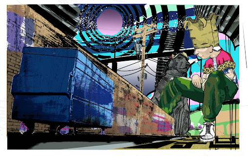
The figure here is as I mentioned before the original work of street artist Sainer. The dog in a propeller cap was a touch of my own, it felt right.

To begin with I was really happy with how the figure looked I kept him at true to life scale, as these were miniatures in the pictures and not actual dumpsters/Utility poles. I liked this it felt like it worked.

I knew if I wanted to keep him though I would require to change the figure to one of my own making but thought I would move on to the sky first to get the base image created.

The skies in these images were all made in Authorship, very helpful really, I spent a lot of time during Authorship making custom sky patterns, which I only really used one or two of in the end, they came in very helpful here.

However the skies were a little scrappy and hastily made so once I had decided on which sky patterns I wanted to use I remade them with a brand new set of opaques, just to ensure the quality of them.

As I started doing this I did suspect I may be pissing about and wasting time I didn't have... This really wasn't the case.


Each of these is a set of opaques I remade from the previous unit for this one. I now have all of these properly filed in a system that allows me to use and reuse them in future prints, this was the first time such a filing system had dawned on me and I've now started keeping all types of cuttings, clippings and transparencies, for future use. 

Now to redo the figure....


This is quite honestly only a small handful of what must have been hundreds of versions of this figure, I obsessively drew him over and over again only to get more and more annoyed at my clear lack of understanding to figure drawing, I found this incredibly frustrating as only a few years ago figurative work was what I would've prided myself in, so this was a real downer.

here's some more....


Too many really!

In the end I never used King Trash as I came to call him, I eventually landed on a drawing I was really quite happy with...


He was certainly my own now and I was happy with the drawing, inspired both by the drawing by sainer and original illustrations of the Mad Hatter from Lewis Carrolls Alice In Wonderland. 

I finally liked the drawing. However, after working for several days to try and get him feeling at home in the rest of the image I realised this was going to be even more of a monumental task than drawing him was.

With the rest of the image being so Highly detailed, due to the use of photography, I couldn't find the right way integrate him. The line drawing I had done fit nicely in the frame but I had to strip back the line drawing in order for the keyblock to be printable (engravers can only do so much), this meant that his detail would have to come from colour build up.

I finalised him with a a range of colours and realised that as he had caused me to add at least 5 new colour blocks to bring me to a total of 22 at the time, he wasn't going to make the cut.

I spent time thinking about another way to integrate him and realised that whichever method I chose it would likely be far easier, safer and quicker to just replace him altogether. A shame but had to be done, I do have the drawing filed for the future though, so King Trash may yet see the process of print.

Back Up Work


Grassy bump

'Floating World'


Sky Studies


All of this brought me up to here...


It's almost ready to take to print just a couple more additions and it should be good. 17 layers, it will be a challenge to print but looking forward to it.




 A2 Print


The A2 print went through so many changes from the time I started it, originally meant to be a triptych, then a waka poem was connected to it and informed the design process going ahead. I tried to make it figurative before deciding against this and in its final stages (bottom image) its very different from what I had in mnd to begin. 

A lot of work and planning went into creating the image which I will try to document as best as I can....


Wednesday 19 May 2021

 The Engravers

I had planned to head into the laser engraving suite pre-easter break. However the workshop was closed most of the week before the break. This meant that I was not able to engrave any of the keyblocks to the prints I had.

This wasn't an ideal situation, I now had two weeks break I thought I would be relaxingly printing over, without the keyblocks this was not possible. So, instead I thought of doing one of two things...

I thought I should either go back to the models and further their paint jobs by finally giving them the graffiti and signs of damage and wear I had always intended for, basically get them exhibition ready was my thinking or..

I could go back to the design phase of the prints and really work on refining the image as highly as I could. I chose this option

By the end of the easter break I had these...


This is the A2 and where I had got to with it by the end of the easter break, a lot of changes from the previous versions that I will go over in another post on the blog, I still wasn't happy with it at this stage and so decided to put off engraving it until I was fully confident in the image.


This A3 print I felt good about right from the time I made the basic composition in the Authorship Unit, ultimately so far I'm far happiest with this design and have decided when finished that this will be the print I send into the Royal Academy 2021 Summer Exhibition.


This A4 was quite simple, Once I had the basic composition down the colours and imagery just seemed to come to me quite the thing, the least trouble designing by far and still an outcome I'm very confident in, think this will be my entry into the Awagami AIMPE 2021, miniature print competition.


 Japanese


Thought I should mention that around the start of the Easter break, I decided to start doing something I had been planning to do for a while... I began learning Japanese. Was told I should include this in my blog and am honestly quite happy I can.

It's been a monumental undertaking in my eyes for too long and as my only goal currently is to in a year or two move to Japan with my work, I knew it would be a necessary one and am happy to say I've kept it up, I now know they're two syllable alphabets by heart, to read, write and (I think) hear.


Just a few sheets worth of Hiragana practice, since then I have moved on to and nearly completed katakana.


Saturday 8 May 2021

 The Floating World


It was about this point I started looking quite deeply into the concept of the floating world or ukiyo that brought about ukiyo-e printing and it was only after reading several different journalistic accounts and takes on it that I realised, the floating world is something very open to interpretation and quite possibly something that each of us carries uniquely.

"During Japan’s Edo period (1615–1868) the phrase "the floating world" (ukiyo) evoked an imagined universe of wit, stylishness, and extravagance—with overtones of naughtiness, hedonism, and transgression. Implicit was a contrast to the humdrum of everyday obligation."

This description of the floating world seemed most fitting to me, as others were trying to claim it was specifically the edo region had to be pictured or that it must include a specific set of iconography to be considered ukiyo-e. I think that's probably not the case and instead was closer to what is described above. Ukiyo-e images reflected a certain characteristic, they had a shared personality that can be read in the quote above.


 Artists


I'll take this opportunity to discuss and explain the direction I was taking these prints in further. I wasn't really up for any more research through this Unit as I had done all that in the previous Units but a little bit of surfing mainly to remind me of artists whose work had interested me before...


POSE


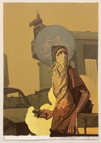
SAINER


ENDI


Adding Things to the Scene


To add anything to these scenes physically, I was faced with a challenge, I would have to be able to draw them in the correct perspective to the rest of the scene although this perspective 'point' didn't really exist, it wasn't something I could easily return to...

But I did try, I had visions of plastering the wall in the big print with 'The Streets' gig posters and Frankie Boyles 'tramadol Nights' event posters, so in order to think about it, I wanted to know how to do it...


So in order to have them in the correct perspective I would have to set the model and camera up in the same places. I did this and then printed the posters out at the correct size for the scale model, drew three rectangles the same size as the phone box on a sheet of paper (below) and stuck my poster on the rectangle where I'd like it on the phone box, I then cut the rectangles out and attached them to the phone box.
These steps were necessary as, if I had just stuck the poster to the model itself I would never have been able to seperate and split the colours of the poster digitally from not being able to fully remove it from the surrounding image.


In the end once I had all seperations made and coloured digitally I organised them in the correct registration on the back of the phone box in Photoshop, decided I didn't like it and flipped the entire thing horizontally.

Ultimately this poster did not make the cut nor did any of the others but glad I know how to do it.